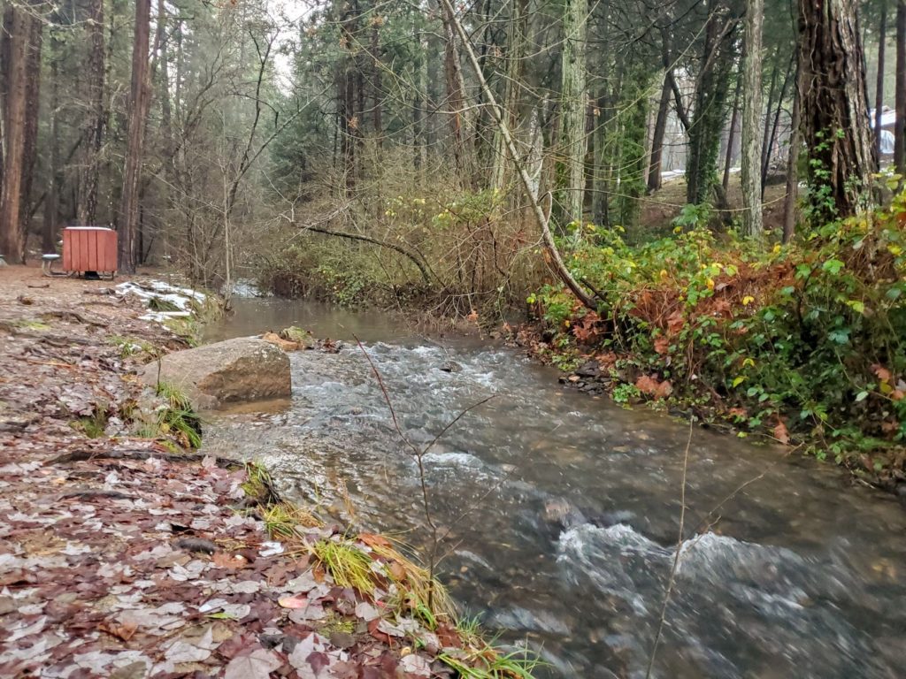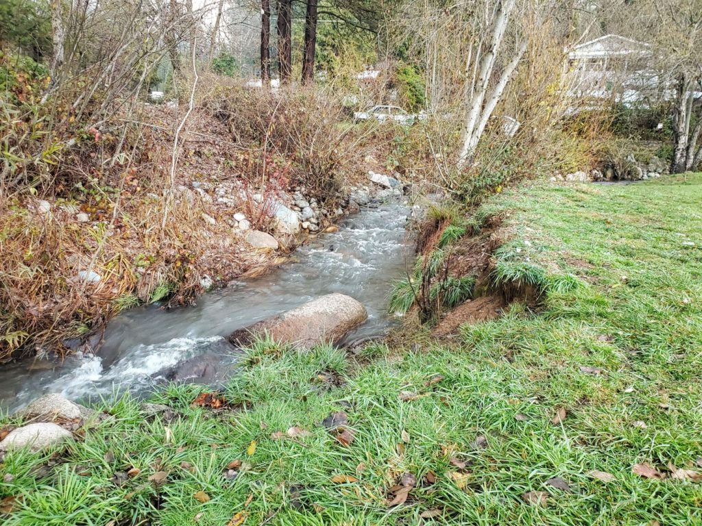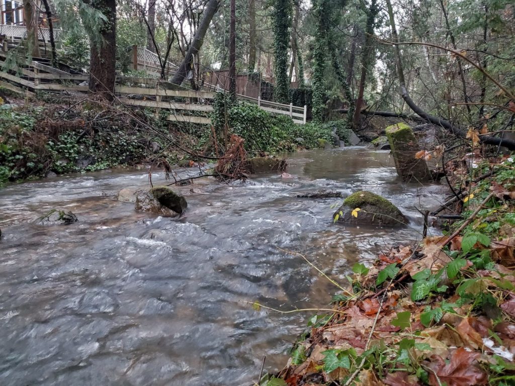
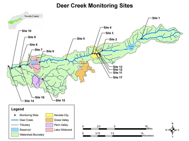
Sierra Streams Institute’s water quality monitoring program is not only our longest-running program but the beginning of our non-profit story! We started when a group of concerned community members began monitoring the creek’s water quality during the construction of the Pine St. bridge over Deer Creek. We now have over 30 active Water Quality volunteers and 29 monitoring sites along Deer Creek and Bear River. We’ve come a long way, and it’s all thanks to this wonderful, dedicated, and nerdy (in the best way) community!
Now, after 20 years of monitoring, we are taking some time to re-evaluate our monitoring sites. It’s time to start thinking about what sites need to be consistently monitored for the health and safety of our community, and which ones we can take a break from to refocus our resources on more vulnerable Sierra watersheds.
So for this data update, I will give a walkthrough of how we determine which sites we should keep and which we should cut.
Choosing the sites
We focused on sites in close proximity that also show similar trends in WQ parameters (ex. conductivity and dissolved oxygen levels). This can signify that these sites are tracking the same changes or phenomena. If we find these types of paired sites, then one often works as a good indicator for the other, allowing us to drop one of the sites. For example, Site 11, 12, and 13 are all clustered together in Pioneer Park; if they show similar trends, then three sites in the park might be overkill.
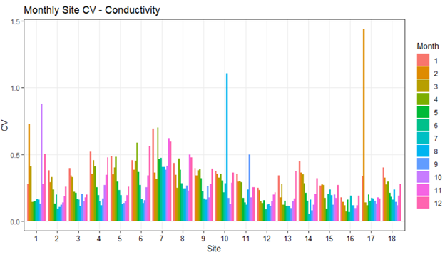
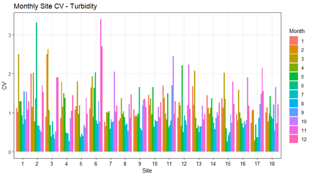
First, we compared the coefficients of variation for each parameter at each site within every month. The coefficient of variation (CV) is the standard deviation (the “spread” of deviation for a group) divided by the mean (the average of a group); it allows us to compare the variability of a dataset in relation to the average of a dataset.
Suppose two sites show a similar pattern for CV of a parameter. In that case, we can explore it more by comparing the two sites directly. Below are two examples of CV graphs we created, one for conductivity and one for turbidity. Sites 11, 12, and 13 produce similar trends throughout the year when compared to each other, so we decided to further explore their relationships.
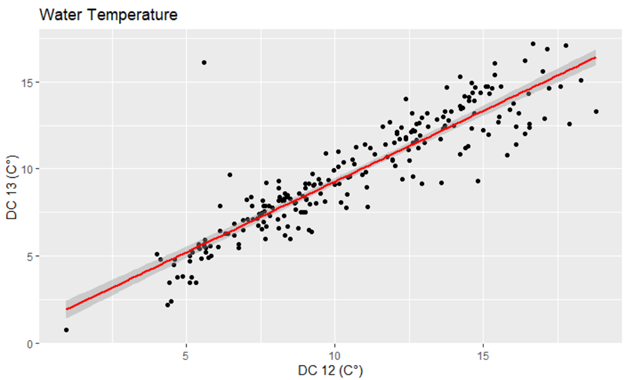
Comparing the sites
Next, we compared each site’s data for one water quality parameter against its potential indicator site’s data using a linear regression. We graphed each site’s parameter data against its potential indicator site’s data in a scatter plot graph with a linear regression line to better show the relationship.
When we plotted all of Site 12’s water temperature data against Site 11 and then Site 13, we found that Site 12 significantly tracked both sites.
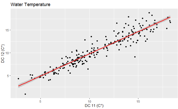
Digging deeper, we found similar trends for conductivity, dissolved oxygen, turbidity, pH, and E. coli levels. We determined that as these sites track such similar trends, we can remove at least one of the sites. We chose to back off from monitoring Site 12 for now.
Future sites
You can find all of our data on RiverDB.org and compare site trends for yourself! Moving forward we will continue to explore where we should remove monitoring sites (such as Site 12) and where we should add them (such as our new Bear River sites to track the impacts of the River Fire).
If you have any questions about our water quality sites, or you have an idea of where we can improve our monitoring efforts, please email me at alex@sierrastreamsinstitute.org.