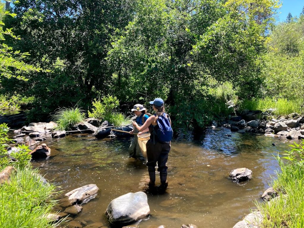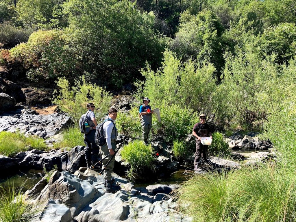
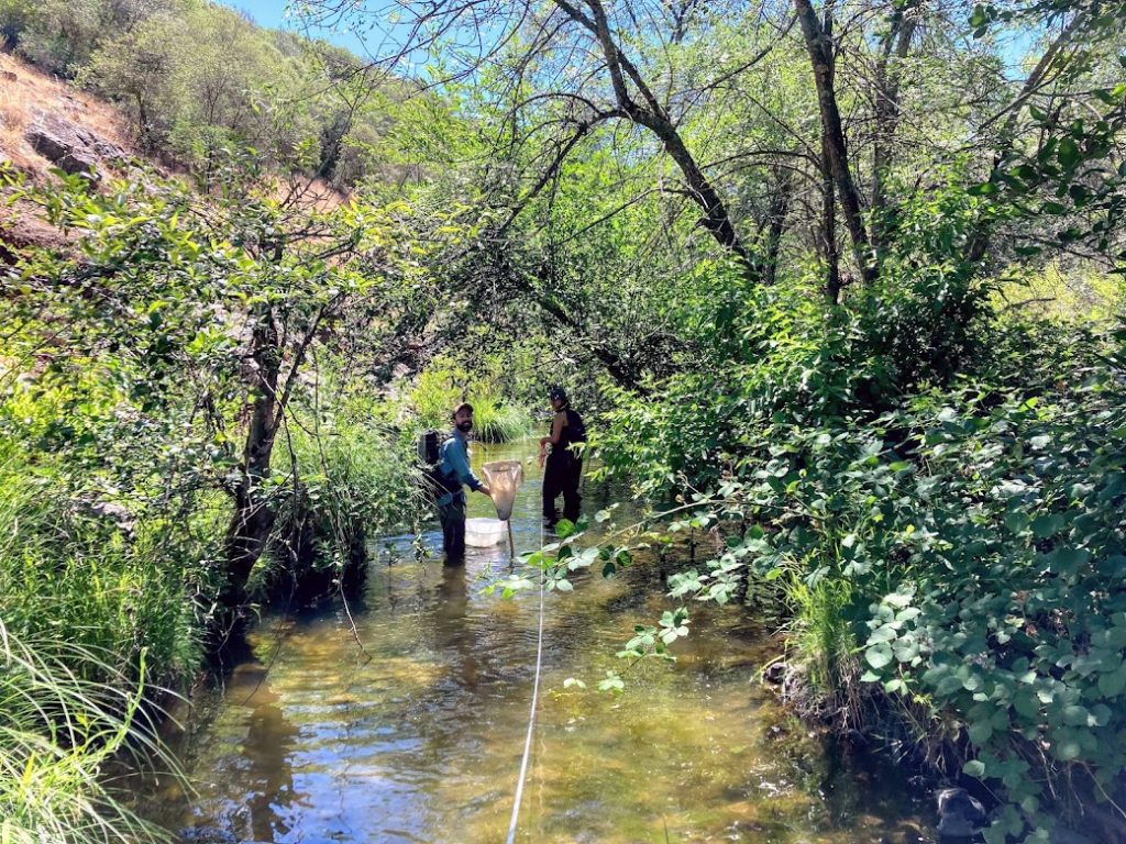
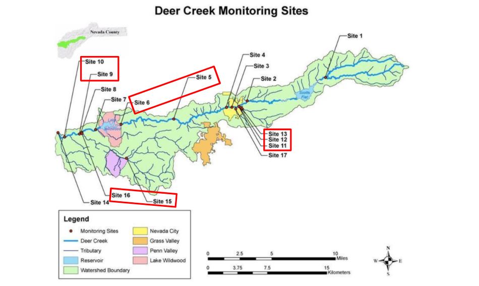
Over the last twenty years, Sierra Streams Institute’s water quality monitoring program has used citizen science to assess the health of the Deer Creek Watershed and engage community members in their local ecosystems. Historically, dedicated volunteers conducted monthly monitoring along eighteen sites spread strategically throughout the watershed. Volunteers measure pH, dissolved oxygen (DO), conductivity, water temperature, and turbidity levels in the field. In addition, they collect water samples which are taken back to the lab and analyzed for nutrient – nitrate and phosphate – and bacteria – coliform and E.coli – content.
Periodically, evaluations of water quality monitoring networks are needed to assess their efficiency, gauge their effectiveness, and maintain or shift their overarching objectives. As described by Strobl and Robillard (2008), “The [water quality monitoring] network design procedure is an iterative process in which any information gained since the last iteration may lead to revisions in the network design at each new iteration.”
Using our extensive, long-term data set, we evaluated the efficiency of our program. We conducted our analysis with the following questions in mind:
- How would reducing sampling frequency from monthly to quarterly (i.e. seasonally) impact the trends we are able to observe from our data?
- Do parameters measured at sites that are geographically close to each other track one another?
To address the first question, we graphed the trends in each parameter over the last twenty years. To simulate quarterly monitoring, we took our original monthly dataset and removed eight of the months per year, leaving only one monitoring month per quarter. We then compared our simulated quarterly graphs to our monthly graphs. Upon visual comparison of the two data sets, we found that the overall trends in water temperature, pH, conductivity, and dissolved oxygen did not significantly differ (Figure 1). In fact, quarterly monitoring reduced much of the “noise” and in many cases provided clearer overall trends.
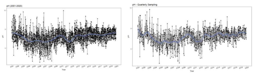
However, reduced frequency monitoring did not capture extremes in turbidity, nutrient and bacteria levels. Turbidity is highly influenced by short-term events, like storms. Nutrients and bacteria levels typically spike in late summer and fall, when flows are minimal and temperatures are high, and following storms, which increase runoff into watersheds.
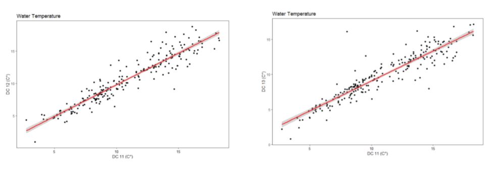
To address the second question, we compared geographically clustered sites (Figure 2). Using linear regression, we statistically determined whether the trends in each parameter tracked one another at these clustered sites. Trends were concluded to be significantly correlated when p <0.05 and the coefficient of determination, R2, was greater than 0.2. We found that several of our clustered sites tracked each other in all parameters (see an example in Figure 3). Using this analysis, we were able to distinguish certain “sentinel” sites, which provide sufficient information on upstream conditions to discontinue monitoring at nearby sites. Monitoring at sentinel sites will allow us to reduce the number of sites we monitor while maintaining a program that adequately captures overall watershed health and detects any substantial changes in parameters.
In response to this analysis, we have made the following changes in our monitoring program. First, we have reduced sampling frequency from monthly to quarterly, and are working to create targeted storm, nutrient and bacteria teams which will be able to better detect the parameters that were not well tracked by a reduced monitoring schedule. We believe that these targeted teams will be better able to track these parameters than our previous monthly monitoring program, which had a set schedule. Second, we have decreased the number of sampling sites from eighteen to nine “sentinel” sites. We will expand to more sites as needed when we see significant changes in parameters at sentinel sites.
Before finalizing the changes to our program, we shared our findings with our community of monitoring volunteers. We listened and incorporated their feedback into our new network design. For example, one volunteer suggested we perform quarterly monitoring on a rolling basis – monitoring a subset of our sites each month, and all of our sites every season (three months). We are now statistically reviewing data to determine feasibility and the impact on the overall trends. Overall, our volunteers were very supportive of the program revisions and excited for the new opportunities that our changes will bring.
By altering our previous monitoring schedule, we can create a more targeted monitoring program, redirect resources to expand our geographic reach, and identify priority areas for restoration. We will continue to work with our community members and partners to build a program that effectively addresses the needs of the watershed.