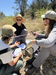
Vegetation Survey on Dry Creek
Last week I had the privilege to tag along with our Restoration Team to participate on their vegetat...

To scientists, data is everything. By collecting and interpreting data, scientist are able to draw logical inferences for their research. Sometimes data needs to be collected over a long period of time in order to get a good understanding of the subject, for example Sierra Streams has 30 years of water quality data we have collected at Deer Creek. When planning for Sierra Streams Fest (SSF), we wanted to create an interactive exhibit that changed throughout the day as we continued to collect data. A lot of discussion went into how we might accomplish this, and how we can keep our data as accurate as possible. We wanted folks walking away from this exhibit thinking critically about data and how it is collected. With this in mind, our exhibit Data Visualization was born.
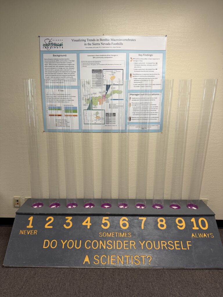
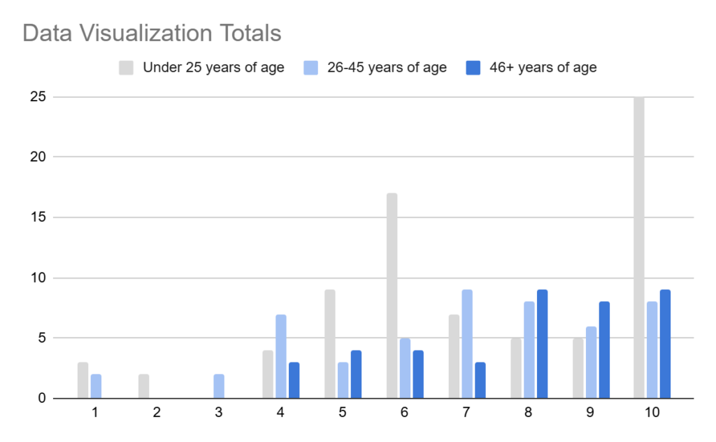
We wanted our main question to focus on a person’s perception of themselves but also in relationship to science. We landed on the question, “Do you consider yourself a scientist?” and everyone who came through the booth was given a ping pong ball to place in the tube for their answer. This question is much more interpretive than it appears. When speaking to SSI staff, I’m talking literal scientists, they told me they answered in 7-8 tubes over the 10. We also wanted to see what would happen if we added demographics as a data point for this exhibit, and landed on three different age ranges as the demographics for this question. The white ping pong balls were given to folks 25 and under. The light blue ping pong balls were given to folks 26-45, and the dark blue ping pong balls were given to those 46 and older. Leading up to the event, my hypothesis was that younger people tend to see themselves more as a scientist. My thinking was as we get older, the less and less we see ourselves as scientists.
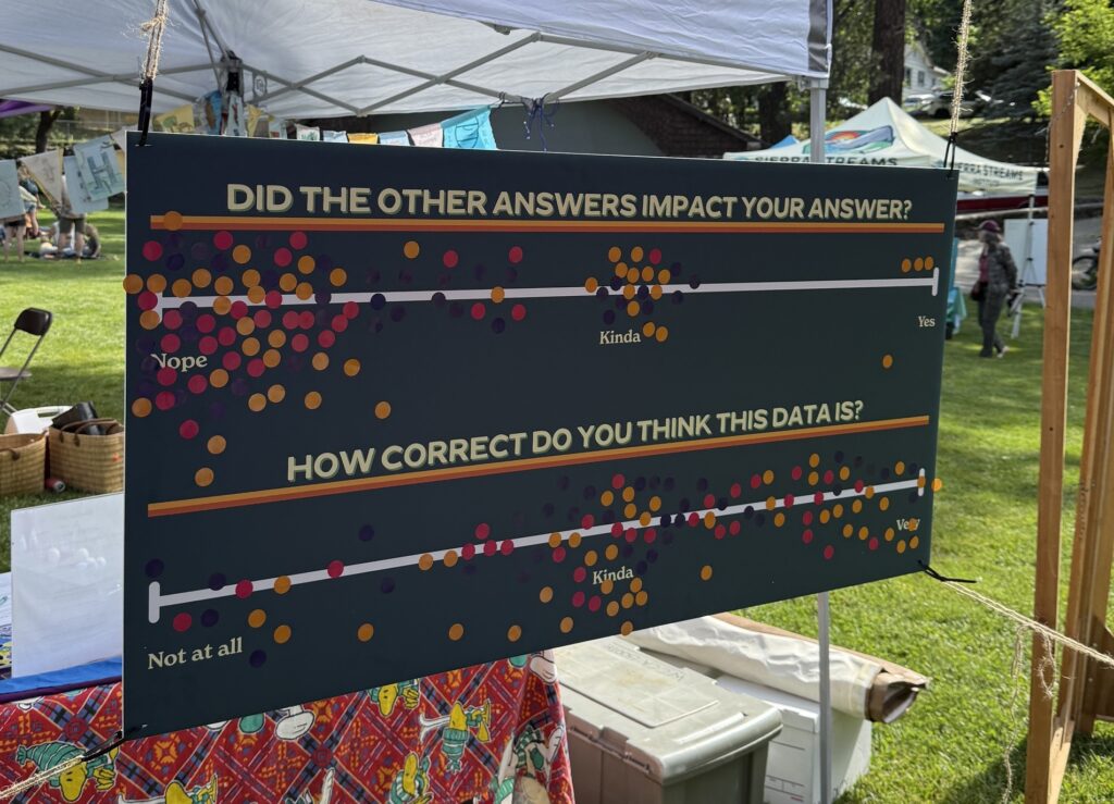
After the main question, participants were given two stickers to answer follow up questions. The idea for these follow up questions was to have them reflect on whether the other answers they saw influenced their answer to the main question. They placed their sticker along a spectrum line between Nope, Kinda and Yes. The first question they answered was, “Did the other answers impact your answer?” followed by “How correct do you think this data is?” This data was also collected demographically, with yellow stickers for folks under 25, purple stickers for ages 26-45, and pink stickers for folks 46+.
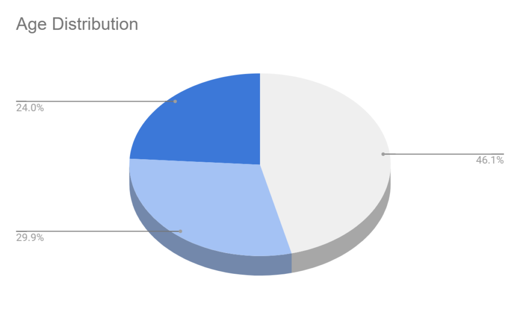
Looking at the overall demographics of participants, which you can see in the pie chart below, the majority of participants were under the age of 25 and contributed to 46% of the total (167 participants). The other two age demographics were close in number with nearly 30% of participants being between the age 26-45, and 24% of the total over the age of 46.
The following bar graph represents the distribution of answer for each age demographic category. For participants under the age of 25, the majority of the answers were between 6 and 10 with 10 being the most answered by this group with a total of 25. This group had some answers in the 1-2 range but zero for 3. Participants between 26-45, had a relatively even split between 4-10 (aside from 5), with few answers in the 1,3 and 5 tubes. The 46+ demographic had no answer below 4 and with the majority in the 8-10 range.
After answering the main questions, participants were given two stickers to reflect on the accuracy of the data. This provided some interesting results as you can see in the image below. Participants under the age of 25 were the only demographic to place stickers stating that other answers did impact their answer. More participants put stickers in the “Kinda” range from both the under 25 and the 26-45 but only one participant over the age of 46. The majority of stickers were placed between the “Kinda” and “Nope”, with more on the “Nope” side stating that their answers were not impacted by the other answers they already saw.
When looking at the data from the second question, we see a wide range of responses. The majority of answers for all demographics was between the “Kinda” and “Very” side of the spectrum. Although not as many stickers were present on the “Very” side of the line than there was on the “Nope” question above. Few stickers were placed near the “Not at All” part of the spectrum.
The results of the data from this exhibit was interesting and somewhat unexpected. When originally thinking about this exhibit, I erroneously thought there would be a higher concentration of participants 25 and younger considering themselves scientists. While the vast amount of folks who answered 10 were under 26 years of age, when looking at the percentage of folks who answered between 8-10 (in the upper range) there is a higher percentage of participants in the 46+ demographic (50% compared to 46%). It was interesting to see a clear split in the younger demographic between 6 (sometimes) and 10 (always). The majority of participants consider themselves a scientist at least sometimes, but no one in the 46+ demographic answered “Never” which was a bit surprising and goes against my initial theory.
Another fascinating aspect of this data exhibit was the follow up questions. While a huge portion of participants answered that they were not influenced by others answers, that seemed to appear less of the case when answering the second question. The majority of participants thought the results were “Kinda” accurate, with some more folks placing there sticker along the line between that and “Very True”. With the majority of people said they were not influenced by other answers, you would think most people would think that the data is accurate, but we did not see that in the data.
There are a lot of things that may have impacted the results of this data. For example, did these age demographics feel appropriate? While at the booth, it felt interesting to see a three year old and a 20 year old represent the same demographic region. Would the results of this exhibit change based on when they participated or where? Was there a bias of information based on the fact that this was at a science and art festival? Even with all of these “what ifs” the goals of the exhibit were achieved. It got us thinking about data, the accuracy of data and how scientist frame their research to get the most accurate data but also how data can be deceiving or lean towards certain bias’. We are excited to see where this exhibit evolves in the future.